In case it wasn’t disgustingly obvious, the Dot and Line has never had a professional designer or art director to define its look and feel. It’s had me, for better or for worse. Mostly I think it’s been for the better. In more than four years, we’ve hosted a website on Medium dot com and a new one on WordPress dot org (fueled by the Editorial theme, with adjustments) and published visually heavy stories, ambitious editorial projects linked by cross-pollinating bits of design, and custom-made brackets.
Doing that and writing and editing stories—as my co-editor, John, has often reminded me as I prepared to shut myself up in a dark room with a wall of sound and the Adobe Creative Suite—is not easy. But I’ve always loved playing with our visuals, no matter how amateurish my art may be, and he and the other editors have, to their credit, never called it bad—even when it was, and even when I somehow convinced John to let me call our first BoJack Horseman package “A Horse With a Name.”

Sometimes, however, my designs are bad. Laughably bad, in fact. So bad that I feel compelled to share them with you! It’s time to wind back the clock and cycle through the logos that Team D+L has rejected over the years, replete with the artist’s color commentary. I hope this journey through time and questionable visuals will allow you to appreciate the very true story of the logo we finally chose. Read on.

The failures…
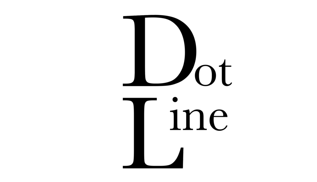
A cry for help, practically screaming “Take the L!”
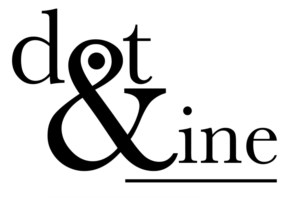
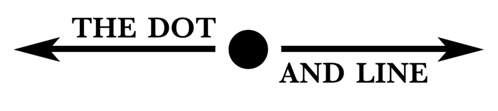
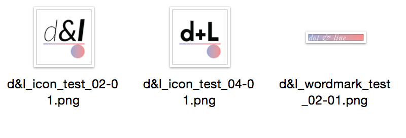
This one doesn’t even pretend to include an isolated dot or a line. We’ll return to that notion.
Dear NASA: Where’s my paycheck?
Good logos make you think. [Swandives off cliff.]
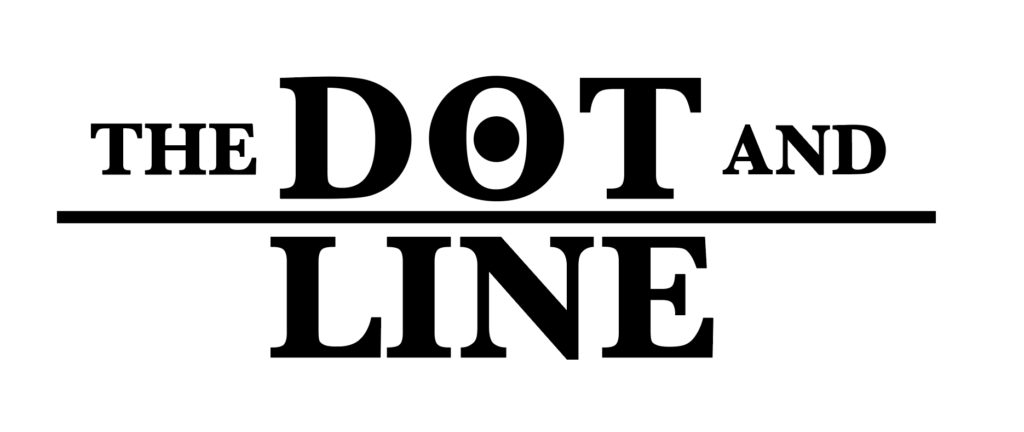
Can neither confirm nor deny that my high-school geometry textbook was propped open for inspiration here.
Obviously I made this one right after binging the first season of Stranger Things at 4 in the morning. Obviously I realized five seconds later that, actually, Adventure Time pulled off the D&D throwback aesthetic better.
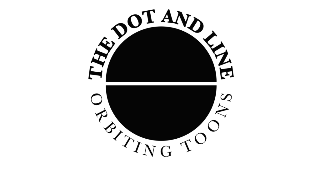
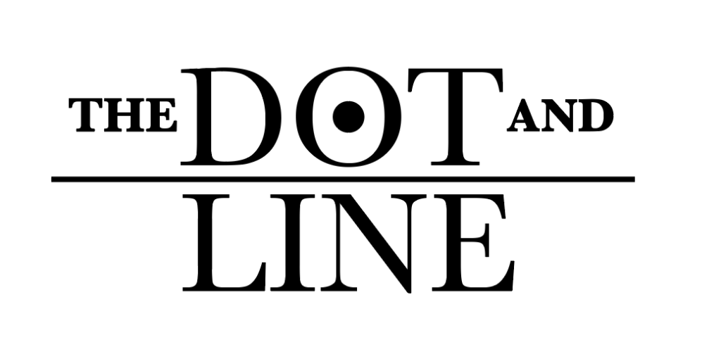
A bold revision on the above, punctuated by my triumphant “a-ha!” upon completion.
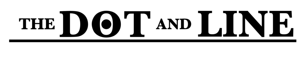
Obviously I made this one thinking the other one felt a little too “chunky.” Note the heavier weights on “THE” and “AND” relative to “DOT” and “LINE.” Visionary.
Simple, direct, void of soul. Like our cartoon site today, but managed by a hedge fund. Sprezza-fucking-tura!
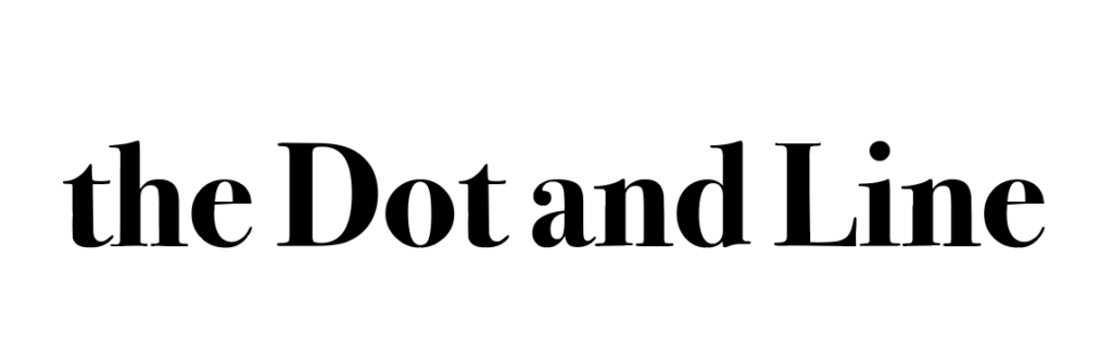
The Dot and Line, guest-edited by Anna Wintour, probably, but with a knockoff typeface. [Eds. note: Anna, Eric is an asshole. If you’re reading this, feel free to guest-edit the Dot and Line before we shut down at the end of this week. We’ll keep him in line.]
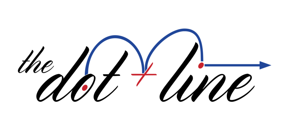
This one is called “weird-bouncy-logo.ai” in my computer, but I honestly don’t see anything “weird” here. Do you?
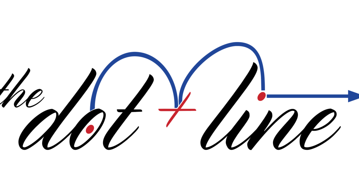
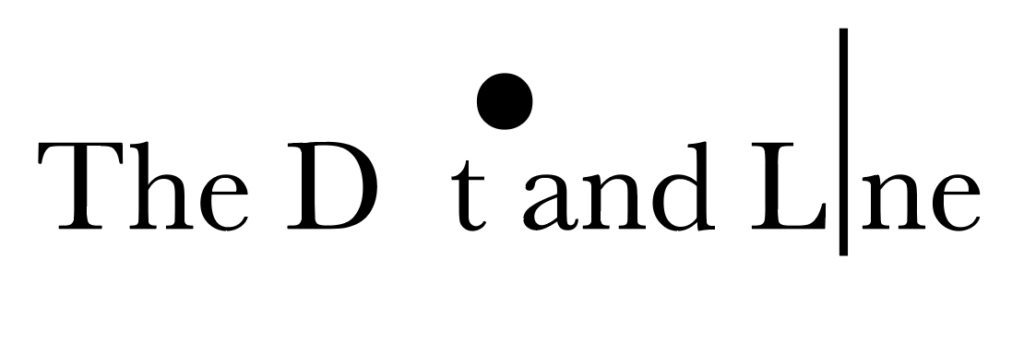
And now, a word on the one that won…
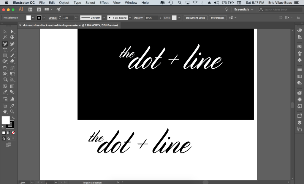
The fact is, the wordmark that wound up being the Dot and Line’s official logo was always supposed to be somewhat temporary. That’s why I was fiddling with ideas well into summer of 2016 and beyond, months after we launched our first website on Medium dot com. I mocked up “the dot + line” in Lost Type Co-Op’s elegant, lilting Cylburn font—a typeface designed by the letterer Dai Foldes. (Real talk, designers: try this font out for your work. I purchased a personal pay-what-you-want license for it in 2016 and later bought a commercial one.) I slapped it onto the cheap (read: free) Medium publication John and I had been using and called it a day.

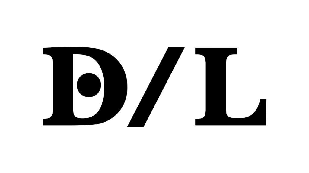
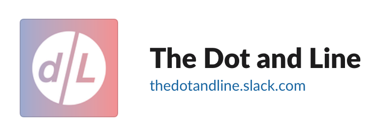
As months turned into years, John and I never made a better logo than the placeholder I mocked up, which still sits at the top of this website, despite the many gorgeous attempts above. We adapted it in a few ways, chopping it up as a lowercased “d/l” and adding pops of color when we made a limited run of business cards (obviously in blue and red, borrowing again from the animated short that inspired this website). We even asked John’s brother Stephen—an actual, like, professional designer and architect—to mock some ideas up for us. The best one he sent our way was a (mostly unintentional, I think?) riff on the Grateful Dead’s Steal Your Face logo and album art. To this day, it’s the logo we use on our editors’ Slack workspace, for reasons unknown even to us. We’ve never changed it.
But through all that, in over four years, the root wordmark, originally rendered in black and white, never changed. The Cylburn logo communicated a subtlety that we aspired to in the pieces we published and—in my humble opinion—a friendly, conversational environment for our readers and writers that felt handwritten, just as the first cartoons were hand-drawn.
The Dot and Line was never intended to be impenetrably nerdy nor oppressively masculine, despite the genders of its cofounders, so blocky text and geeky novelty fonts were never going to work. It was also never supposed to feel as staid or rigid as the pages of a newspaper, so journalistic serifs were never going to work either, as the designs above prove. This site was always intended to feel personal, like a notebook you doodled in, which is why the Cylburn treatment wound up as our winner effectively by accident. And the type treatment proved versatile over the years, making its way onto our one-off ‘zines, social media platforms, two websites, and more. Not bad for an amateur.
Thanks for reading The Dot and Line, where we’ve written about animation of all kinds for more than four years. We’ll miss you! If you’ll miss us too, show us some love on Twitter and show our writers the money on GoFundMe. Read our goodbyes here: That’s All, Folks!