If Gravity Falls is about anything, it’s about change. In real life and on the show, when September starts, time’s up. Just like Mabel, Dipper and other students the world over, this year, when the end of August rolled around, I was bracing myself to head back to school. In between hectic packing and frantically trying to re-learn everything I’d forgotten over the summer (a lot, as it turns out), I decided to treat myself by re-watching Gravity Falls. It’s a brilliant coming-of-age story, and I felt it still had a lot to teach me as a 21-year-old saying goodbye to the summer.
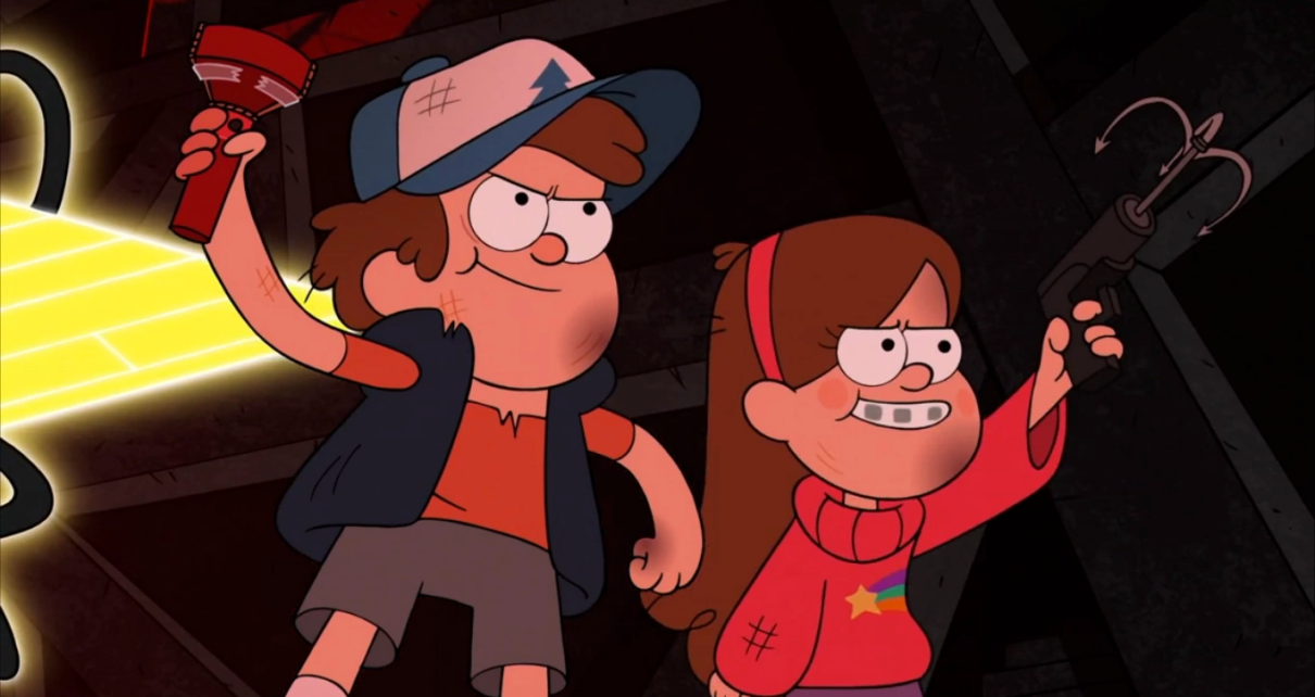
As I was watching the now-familiar plot unfold, something struck me that I had never really noticed before: the huge disparity between the protagonists’ characterization and their miniature, childish character designs. Dipper and Mabel are drawn tiny, and yet anyone who’s seen this show will wax poetic about their deep development, both personally and in relation to the characters around them.
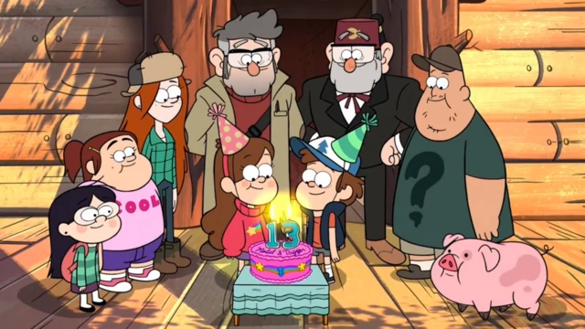
The more you watch Gravity Falls, the more you realize the show uses that dissonance artfully to express the fact that the twins and their young teenage friends are in a state of metamorphosis.Throughout the show, Dipper, Mabel, Grenda, Candy, and Pacifica act like teens — indeed, their wisdom and maturity sometimes surpasses that of the adults around them. They’re interested in growing up, in science, in attraction, and in saving the world. But physically, they only come up to the adults’ waists. Their friend Wendy, only a few years older, is drawn twice as tall as Dipper, highlighting the experiential gulf between them. To put that in perspective, in the real world, most human beings have already undergone more than 80% of their upward growth by the time they hit 13.
In some ways, Dipper and Mabel are practically grown-ups already. They just want to get on with cracking codes, breaking hearts, and saving the world. But in others, they are still children. For all their big talk, they are dwarfed visually by their surroundings, and we sense every episode how very small they are. The art team’s exaggeration is deliberate and effective, and it’s worth asking: why animate your two protagonists this way?
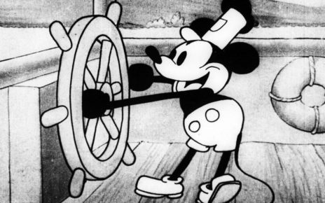
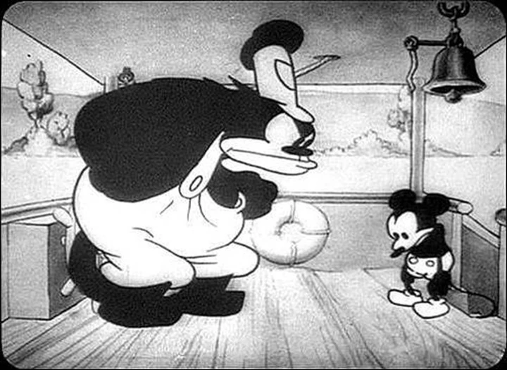
To find the answer, it’s a good idea to look at other animation. Cartoons as an art form have always been about physical exaggeration. From the playful to the grotesque and the downright offensive, cartoons thrive from warping our objective visual reality into something more stylised and visceral. Disney’s been dreaming up exaggerated character designs since the brutish cat Pegleg Pete and cute Mickey Mouse boarded Steamboat Willie in 1928. And Gravity Falls has good company amongst other, more recent cartoons too. Steven Universe and Over the Garden Wall both use stylization and caricature to brilliant effect. The bold, expressive designs of Steven Universe’s alien cast wonderfully feed into its world-building and character development. And in Over the Garden Wall, the contrast between Greg and Wirt’s stature perfectly encapsulates the complexities of their sibling relationship. Gravity Falls isn’t using especially new or unusual artistic methods or techniques, but it does capitalize on those techniques unusually well. The show is remarkable only due to the quality with which it executes these physical exaggerations, and the emotional power which it packs into its character design.
Through the slightly cruel honesty of caricature, Gravity Falls depicts Dipper, Mabel, and their teen friends as they are, rather than as they wish to or even perceive themselves to be. Dipper’s childish design, for example, makes it painfully obvious to us, the viewers, that he and his older crush, Wendy, are worlds apart — a lesson it takes Dipper most of the show to learn. It’s a simple decision that visually hammers home another recurring theme of the show: the differences between fantasy and reality, theory and practice, heroism and goodness. Gravity Falls doesn’t shy away from turbulence or uncertainty. It lets its characters feel unsure where they belong and where they stand, whether they are big or small. Dipper and Mabel’s smallness makes it clear as day to the audience that while they are on the brink of becoming teenagers, they are not quite there yet.
Before I started watching Gravity Falls, I was put off the show by what I perceived as a crass, almost vicious level of exaggeration in the character design: Soos’ buck-teeth, Robbie’s zits, Mabel’s braces, Stan’s red nose. Even Bill — with his expressively expressionless, inhuman design — is enough to creep anyone out. But having watched and loved the show, I now realise that Alex Hirsch and the other minds behind Gravity Falls actually want to make us feel a bit uncomfortable, at least on some level. Emotional truth always does that, whether through comedy or tragedy.
This is a show about growing up, finding your feet, making mistakes and learning from them. That applies to kids on the cusp of adolescence, like Dipper and Mabel, or adults facing the wrong side of middle age, like Stan and Ford. Far from being crass, Gravity Falls’ art style accomplishes a complex, sophisticated mission: it’s designed to transport us to another world, and make us see our own with fresh eyes. If you’re looking for a show to watch (or re-watch), I can’t recommend it enough.
Thanks for reading The Dot and Line, where we talk about animation of all kinds. Don’t forget to for this article and follow us on Twitter and Facebook.